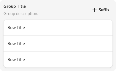
Boxed Lists
Libadwaita provides API to implement the boxed lists pattern.
Boxed lists are composed of a GtkListBox with the
GtkListBox:selection-mode set to GTK_SELECTION_NONE and with the
.boxed-list style class.
GtkListView cannot be used as a boxed list at the moment.
An example boxed list:
<object class="GtkListBox">
  <property name="selection-mode">none</property>
  <style>
    <class name="boxed-list"/>
  </style>
  <child>
    <object class="AdwActionRow">
      <property name="title">Item 1</property>
    </object>
  </child>
  <child>
    <object class="AdwActionRow">
      <property name="title">Item 2</property>
    </object>
  </child>
  <child>
    <object class="AdwActionRow">
      <property name="title">Item 3</property>
    </object>
  </child>
</object>

Rows
A number of predefined list row classes are available and intended to be used inside boxed lists:
Action Rows
AdwActionRow is a basic row. It has a title, a subtitle, an icon, and can
have prefix and suffix children.

Expander Rows
AdwExpanderRow is similar to AdwActionRow, but can expand to show
other rows.

Combo Rows
AdwComboRow is a row with an embedded drop down menu, similar to
GtkDropDown.

Preferences Group
AdwPreferencesGroup provides a boxed list along with a title and a
description. It’s mainly meant to be used as a child of AdwPreferencesPage,
but can also be used separately.
