Class
AdwHeaderBar
Description [src]
final class Adw.HeaderBar : Gtk.Widget {
  /* No available fields */
}
A title bar widget.

AdwHeaderBar is similar to GtkHeaderBar, but provides additional
features compared to it. Refer to GtkHeaderBar for details.
AdwHeaderBar:centering-policy allows to enforce strict centering of
the title widget, this is useful for AdwViewSwitcherTitle.
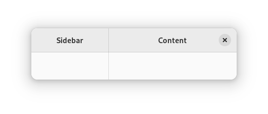
AdwHeaderBar:show-start-title-buttons and
AdwHeaderBar:show-end-title-buttons allow to easily create split
header bar layouts using AdwLeaflet, as follows:
<object class="AdwLeaflet" id="leaflet">
  <child>
    <object class="GtkBox">
      <property name="orientation">vertical</property>
      <child>
        <object class="AdwHeaderBar">
          <binding name="show-end-title-buttons">
            <lookup name="folded">leaflet</lookup>
          </binding>
        </object>
      </child>
      <!-- ... -->
    </object>
  </child>
  <!-- ... -->
  <child>
    <object class="GtkBox">
      <property name="orientation">vertical</property>
      <property name="hexpand">True</property>
      <child>
        <object class="AdwHeaderBar">
          <binding name="show-start-title-buttons">
            <lookup name="folded">leaflet</lookup>
          </binding>
        </object>
      </child>
      <!-- ... -->
    </object>
  </child>
</object>

CSS nodes
headerbar
╰── windowhandle
    ╰── box
        ├── widget
        │   ╰── box.start
        │       ├── windowcontrols.start
        │       ╰── [other children]
        ├── [Title Widget]
        ╰── widget
            ╰── box.end
                ├── [other children]
                ╰── windowcontrols.end
AdwHeaderBar‘s CSS node is called headerbar. It contains a windowhandle
subnode, which contains a box subnode, which contains two widget subnodes
at the start and end of the header bar, each of which contains a box
subnode with the .start and .end style classes respectively, as well as a
center node that represents the title.
Each of the boxes contains a windowcontrols subnode, see
GtkWindowControls for details, as well as other children.
Accessibility
AdwHeaderBar uses the GTK_ACCESSIBLE_ROLE_GROUP role.
| Available since: | 1.0 |
Instance methods
adw_header_bar_get_centering_policy
Gets the policy for aligning the center widget.
Available since: 1.0
adw_header_bar_get_show_end_title_buttons
Gets whether to show title buttons at the end of self.
Available since: 1.0
adw_header_bar_get_show_start_title_buttons
Gets whether to show title buttons at the start of self.
Available since: 1.0
adw_header_bar_pack_end
Adds child to self, packed with reference to the end of self.
Available since: 1.0
adw_header_bar_pack_start
Adds child to self, packed with reference to the start of the self.
Available since: 1.0
adw_header_bar_set_centering_policy
Sets the policy for aligning the center widget.
Available since: 1.0
adw_header_bar_set_show_end_title_buttons
Sets whether to show title buttons at the end of self.
Available since: 1.0
adw_header_bar_set_show_start_title_buttons
Sets whether to show title buttons at the start of self.
Available since: 1.0
Methods inherited from GtkAccessible (10)
gtk_accessible_get_accessible_role
Retrieves the GtkAccessibleRole for the given GtkAccessible.
gtk_accessible_reset_property
Resets the accessible property to its default value.
gtk_accessible_reset_relation
Resets the accessible relation to its default value.
gtk_accessible_reset_state
Resets the accessible state to its default value.
gtk_accessible_update_property
Updates a list of accessible properties.
gtk_accessible_update_property_value
Updates an array of accessible properties.
gtk_accessible_update_relation
Updates a list of accessible relations.
gtk_accessible_update_relation_value
Updates an array of accessible relations.
gtk_accessible_update_state
Updates a list of accessible states. See the GtkAccessibleState
documentation for the value types of accessible states.
gtk_accessible_update_state_value
Updates an array of accessible states.
Methods inherited from GtkBuildable (1)
gtk_buildable_get_buildable_id
Gets the ID of the buildable object.
Properties
Adw.HeaderBar:show-end-title-buttons
Whether to show title buttons at the end of the header bar.
Available since: 1.0
Adw.HeaderBar:show-start-title-buttons
Whether to show title buttons at the start of the header bar.
Available since: 1.0
Properties inherited from GtkWidget (34)
Gtk.Widget:can-focus
Whether the widget or any of its descendents can accept the input focus.
Gtk.Widget:can-target
Whether the widget can receive pointer events.
Gtk.Widget:css-classes
A list of css classes applied to this widget.
Gtk.Widget:css-name
The name of this widget in the CSS tree.
Gtk.Widget:cursor
The cursor used by widget.
Gtk.Widget:focus-on-click
Whether the widget should grab focus when it is clicked with the mouse.
Gtk.Widget:focusable
Whether this widget itself will accept the input focus.
Gtk.Widget:halign
How to distribute horizontal space if widget gets extra space.
Gtk.Widget:has-default
Whether the widget is the default widget.
Gtk.Widget:has-focus
Whether the widget has the input focus.
Gtk.Widget:has-tooltip
Enables or disables the emission of the ::query-tooltip signal on widget.
Gtk.Widget:height-request
Override for height request of the widget.
Gtk.Widget:hexpand
Whether to expand horizontally.
Gtk.Widget:hexpand-set
Whether to use the hexpand property.
Gtk.Widget:layout-manager
The GtkLayoutManager instance to use to compute the preferred size
of the widget, and allocate its children.
Gtk.Widget:margin-bottom
Margin on bottom side of widget.
Gtk.Widget:margin-end
Margin on end of widget, horizontally.
Gtk.Widget:margin-start
Margin on start of widget, horizontally.
Gtk.Widget:margin-top
Margin on top side of widget.
Gtk.Widget:name
The name of the widget.
Gtk.Widget:opacity
The requested opacity of the widget.
Gtk.Widget:overflow
How content outside the widget’s content area is treated.
Gtk.Widget:parent
The parent widget of this widget.
Gtk.Widget:receives-default
Whether the widget will receive the default action when it is focused.
Gtk.Widget:root
The GtkRoot widget of the widget tree containing this widget.
Gtk.Widget:scale-factor
The scale factor of the widget.
Gtk.Widget:sensitive
Whether the widget responds to input.
Gtk.Widget:tooltip-markup
Sets the text of tooltip to be the given string, which is marked up with Pango markup.
Gtk.Widget:tooltip-text
Sets the text of tooltip to be the given string.
Gtk.Widget:valign
How to distribute vertical space if widget gets extra space.
Gtk.Widget:vexpand
Whether to expand vertically.
Gtk.Widget:vexpand-set
Whether to use the vexpand property.
Gtk.Widget:visible
Whether the widget is visible.
Gtk.Widget:width-request
Override for width request of the widget.
Properties inherited from GtkAccessible (1)
Gtk.Accessible:accessible-role
The accessible role of the given GtkAccessible implementation.
Signals
Signals inherited from GtkWidget (13)
Gtk.Widget::destroy
Signals that all holders of a reference to the widget should release the reference that they hold.
Gtk.Widget::direction-changed
Emitted when the text direction of a widget changes.
Gtk.Widget::hide
Emitted when widget is hidden.
Gtk.Widget::keynav-failed
Emitted if keyboard navigation fails.
Gtk.Widget::map
Emitted when widget is going to be mapped.
Gtk.Widget::mnemonic-activate
Emitted when a widget is activated via a mnemonic.
Gtk.Widget::move-focus
Emitted when the focus is moved.
Gtk.Widget::query-tooltip
Emitted when the widgets tooltip is about to be shown.
Gtk.Widget::realize
Emitted when widget is associated with a GdkSurface.
Gtk.Widget::show
Emitted when widget is shown.
Gtk.Widget::state-flags-changed
Emitted when the widget state changes.
Gtk.Widget::unmap
Emitted when widget is going to be unmapped.
Gtk.Widget::unrealize
Emitted when the GdkSurface associated with widget is destroyed.
Signals inherited from GObject (1)
GObject.Object::notify
The notify signal is emitted on an object when one of its properties has its value set through g_object_set_property(), g_object_set(), et al.